|
|
Post by Dom-Ination on Dec 27, 2005 20:57:43 GMT
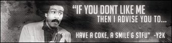
  well there it is |
|
|
|
Post by The New King of Hardcore on Dec 27, 2005 21:03:04 GMT
hey got any left LOL
Banner is good i like it but the Stars are anoying lol 9.5/10
|
|
|
|
Post by LyPhe2k on Dec 27, 2005 21:03:44 GMT
Stop using those starry brushes Dom!
Font is meh.
Pic to the far figh tlooks low quality and looks like he's chewing something.
|
|
|
|
Post by Dom-Ination on Dec 27, 2005 21:08:22 GMT
LMAO there not stars there dots haha  ,lol and the right pic when i got it was very dark so i tried my best to ge tthe quality best i could so  damn bug LOL  |
|
|
|
Post by ECW-RVD on Dec 27, 2005 21:23:54 GMT
its doent seam balanced. the left side looks to heavy compaired to the right
|
|
|
|
Post by LyPhe2k on Dec 27, 2005 21:29:22 GMT
Thats because Dom is a innovative GENIOUS! Dom, its spelt GeniUs, genious >__> |
|
|
|
Post by Dom-Ination on Dec 27, 2005 21:34:17 GMT
lol oh yeah,u no i suck at spelling dont laugh  es LOL ill fix that i thaught i spelt it wrong and thanx bug i am a genius arnt I ahahahha  lol nah kk ill fix that use some levels on bg to get it even then, lol ecw-rvd |
|
|
|
Post by Orton on Dec 27, 2005 21:39:36 GMT
if i havent told u once ive told u too many times , stop using that brush !!!!!! , also right pic is crap lol  |
|
|
|
Post by RKOrton on Dec 27, 2005 21:45:38 GMT
bg is boring, u need a main pic and the text isnt so good 7.5/10
|
|
|
|
Post by ECW-RVD on Dec 27, 2005 22:37:52 GMT
dude i was being serious i dont know whats funny about what i said. there is more on the left side than the right. the right side has to much empty space compaired to the left |
|
|
|
Post by JaeTM on Dec 28, 2005 5:05:08 GMT
Too much empty space. Too blue.
|
|
|
|
Post by OldSkoolSoldier on Dec 28, 2005 12:52:33 GMT
if u could just cut off a cm at the right side it would be gr8 nice text and i like the texture 2 the bg and it looks like alot of people cant spell not just dom E.G. eVALASt-/Y2kbug2000 : Pic to the far figh tlooks low quality  ?? ,ECW-RVD :its doent seam balanced (wrong type of 'seem')  anyway dom 8.8/10 |
|
|
|
Post by Untitled.112 on Dec 28, 2005 14:18:33 GMT
I actually really like it, not just because im a hardy fanboy, i just like the way its made...
|
|
|
|
Post by ~Sage~ aka jc101 {JC-Unit} on Dec 28, 2005 14:23:09 GMT
Umm too much empty space on the right side of the sig, the right pic looks bad and it has bad quality, spell Genius right next time lol and I don't really like the font for the text also stop using the stars in your banners lol overall alright banner but not your best work
|
|