|
|
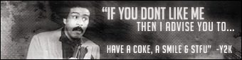
Post by JerichoMNC on Dec 22, 2005 6:47:32 GMT
  Rate/Hate/Suggestions???Pretty much any feedback is appreciated. |
|
|
|
Post by Orton on Dec 22, 2005 13:24:47 GMT
1st one is good , but its too bright around the pic , as for the second 1 , the bg needs texture as its plain
|
|
skelarot
Jobber
 I own... And that's a fact!
Posts: 80
|
Post by skelarot on Dec 22, 2005 13:27:19 GMT
I like both of them but you should really change the '2BME text' on the second one to something else. It just does not flow with the sig, just my opinion  |
|
|
|
Post by JaeTM on Dec 22, 2005 19:46:06 GMT
I like both of them. They look really nice. And the 1st one is a tad bright but nothing huge. Gj on them.
|
|
|
|
Post by LyPhe2k on Dec 22, 2005 19:47:35 GMT
Use the second, the first is plain. But for the second..make the text look smoother. Next to the font size you'll see a space that says "none". Click it and choose "strong" or something.
|
|
|
|
Post by JerichoMNC on Dec 22, 2005 20:06:24 GMT
Thanks for all of the suggestions everyone. I will post an updated version sometime later today.
|
|
|
|
Post by CozyMoo on Dec 22, 2005 20:09:14 GMT
i think tht there both quite good , but the first one seems to be a little better altho it does seem a little bright
|
|